Padding reserves vertical space and Gap adds separation, so the box can't sit on top of neighbouring content.
This is some text inside of a div block.
The short version
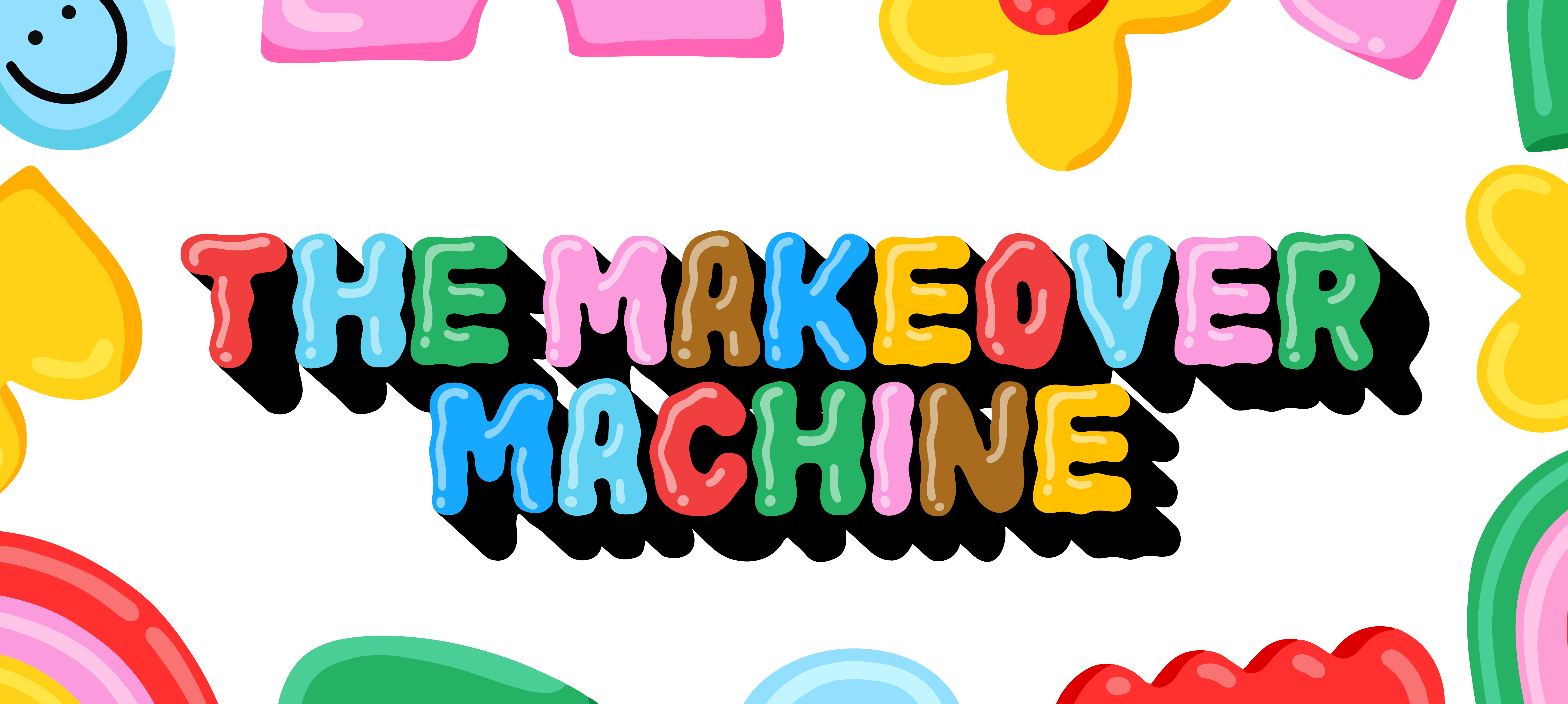
Meg's whole thing is maximalist type. Layered color fonts, every letter a different color, goopy shadows, nothing beige. The problem was that her tools couldn't actually hold any of that. Making a deck meant designing in Illustrator, outlining the type, exporting it as flat images, and rebuilding the whole thing in Keynote. If she spotted a typo, she started the chain over.
I moved her practice into Figma, rebuilt her brand system as live editable components, and wrote a custom Figma plugin The Makeover Machine that brought her layered SVG type into Figma as real text and automated the styling work that was eating her days.
None of it involved feeding her design to AI, which mattered a lot to both of us.
"This saved me 70% of my work process." - Meg! Lewis
Phase 1
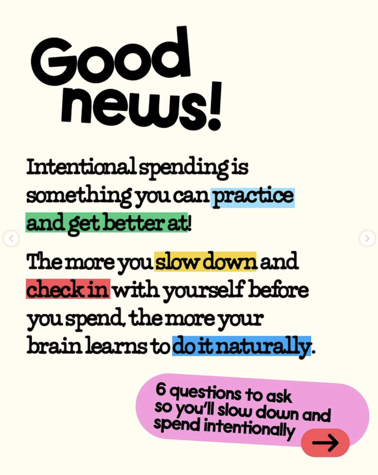
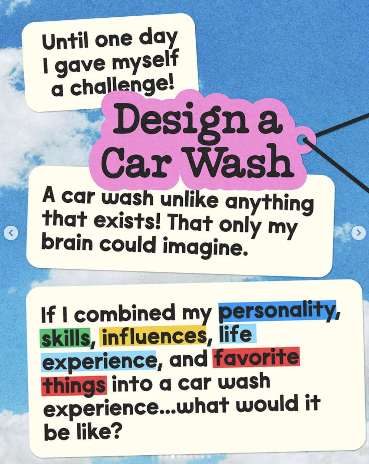
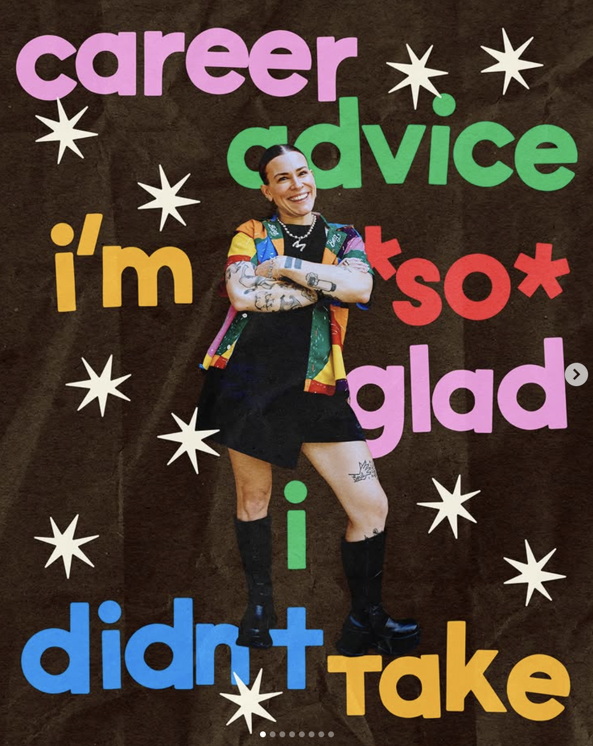
Instagram carousels
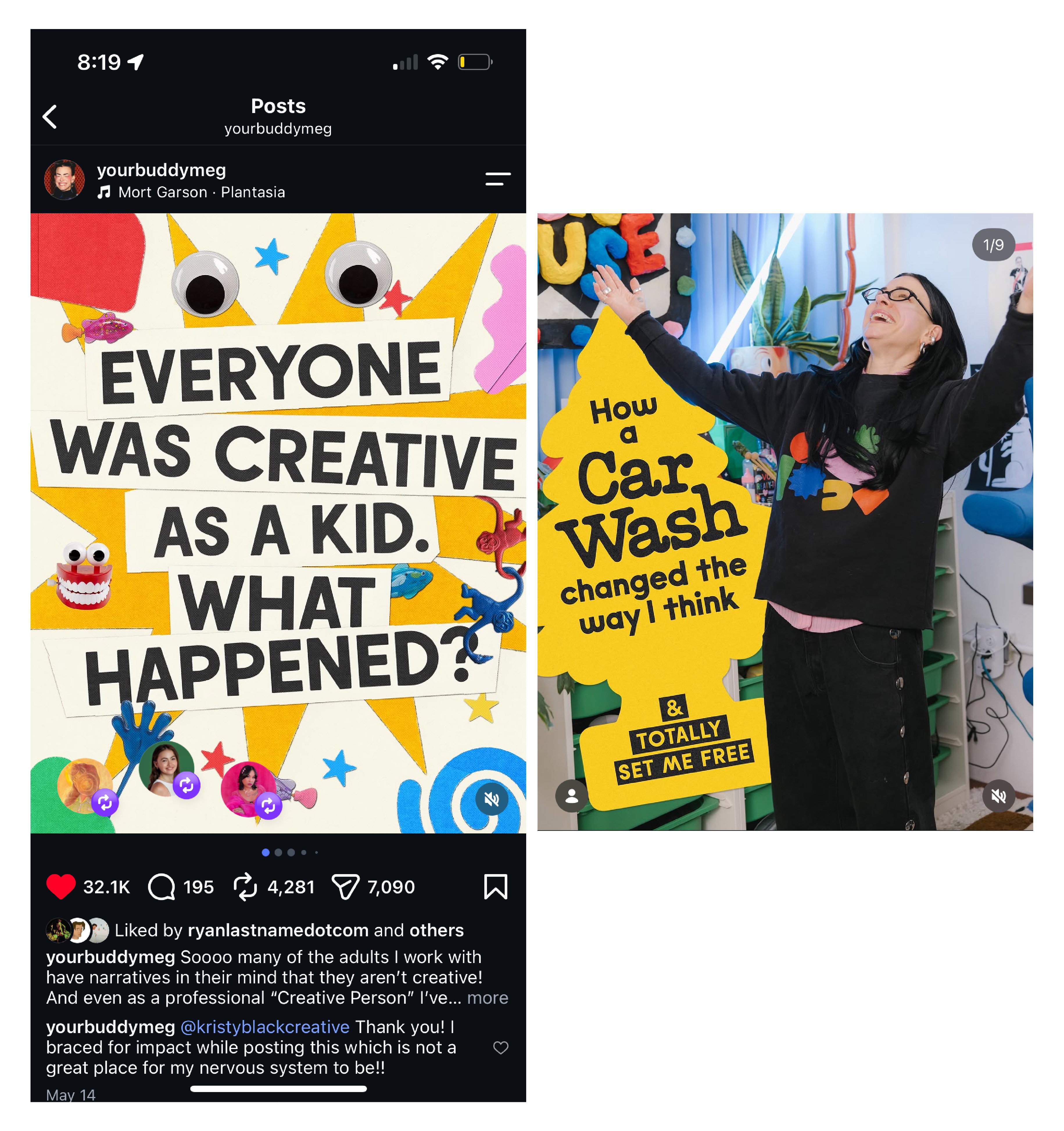
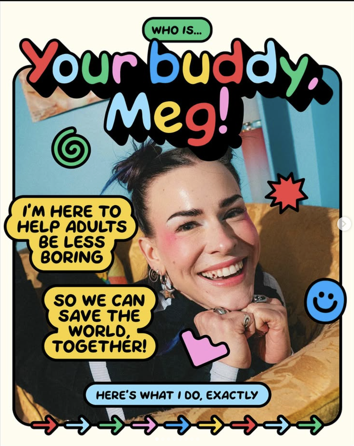
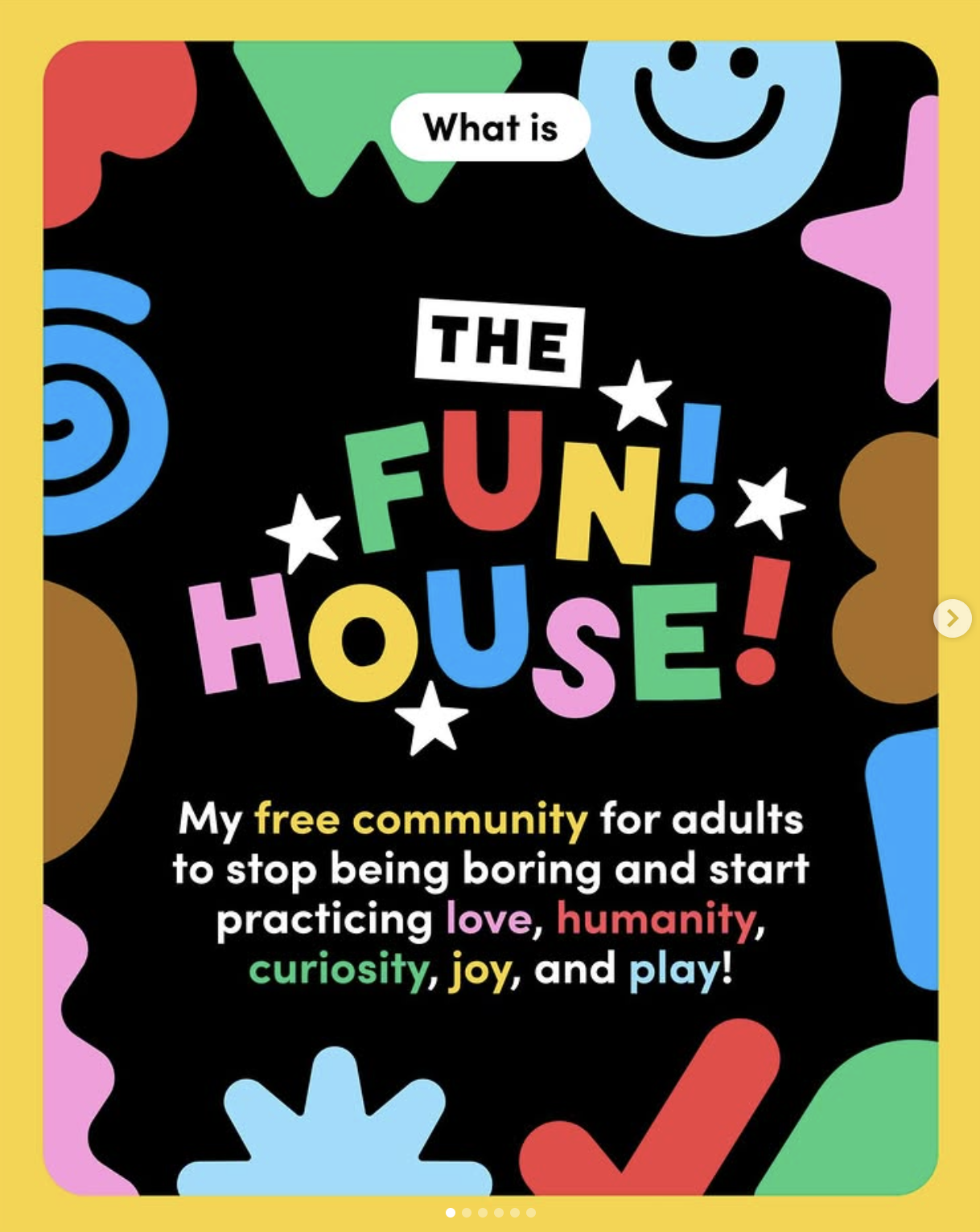
I got hired to make Instagram carousels. Two useful things came out of that.
The first is that one of the posts hit 32k likes.
The second is less obvious but ended up mattering more: making work inside her brand taught me how the brand actually behaves. How the curvy geometry gets built, how the type stacks, what the color logic really is once you're in it. And I got to watch where the friction was firsthand instead of being told about it.
That's the whole reason the migration went well. I wasn't reading a brand guide and guessing. I'd already been building in the thing.
Brand Examples
Phase 2
Setting her up for success first
I didn't want to start dragging files around before the foundation was right.
Checked the seat actually did what she needed. Meg works for herself, so this wasn't a team rollout, just making sure nothing the new setup depended on was gated before I built on top of it.
Moved the brand over. Colors, fonts, type sizing, images, graphics, icons, all of it out of Illustrator and into Figma. One rule I wouldn't bend on: everything stays vector and non-destructively editable. No flattened PNGs standing in for real artwork - that's how you end up right back where you started.
Built the foundations. Colors and type as proper styles, anything she reaches for constantly as components with variants. Swapping an icon became picking from a dropdown instead of redrawing it.
Phase 3
The presentation template
The old deck process was two tools doing one job. Design the slides in one place, rebuild them in Keynote, then change everything twice whenever anything changed.
So I built her a master presentation template in Figma that she starts every new deck from:
Slide layouts as reusable frames that stay movable and editable
Graphics and icons as components, so when a different illustration fits better she just swaps it - including things like icon lists where one change used to mean touching every item
Colors and type wired to styles, so a change at the system level actually travels
One file. Design it, edit it, present from it. No handoff step at the end.
The point wasn't making it prettier. It was killing the second half of the pipeline entirely so she could change her mind quickly, mid-build, the way she actually works.
Phase 4
The Ooze Out Loud problem
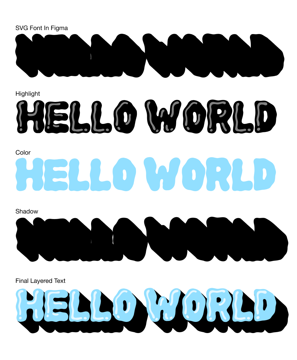
Ooze Out Loud is Meg's own color SVG font. It's built in layers, highlight, main color, background shadow, and those layers are the entire point of it. Neither Figma nor Keynote supports color SVG fonts at all.
Her workaround was to set the type in Illustrator, outline it, export it as an image, and bring it in. Every single time she wanted to use one of her most recognizable assets. Huge time suck, and completely un-fixable after the fact.
There was no existing solution that gave you editable text and kept the layered color and shading. So I made one.
How it works:
I took the font apart. Separated the SVG font into its actual pieces, highlight, main color, background shadow, and rebuilt them as standard TTFs that Figma treats like any other font.
Then I built the generator. The first tab of the plugin takes text you've already typed on the canvas and generates the full layered treatment from it, respecting the alignment, spacing, and letterforms of the original SVG font.
And it stays editable. What comes out is real layered text you can recolor and retype. A spelling mistake is a spelling mistake again, not a reason to redo an hour of work.
On licensing: Ooze Out Loud is a commercial font Meg sells, so the derivative TTF layers were built for her own use, as the font's creator and rights holder. Nothing was redistributed.
This is the part I'm most proud of. A font that was technically incompatible with the tool she was moving into became a native asset in it.
Ooze Tools
0 elements tagged
Padding reserves vertical space and Gap adds separation, so the box can't sit on top of neighbouring content.
Phase 5
Automating the tedious parts of maximalism
Meg gives every letter in a word a different color all the time. It's a signature, not a one-off. But doing it by hand means clicking into letter after letter, deciding on a palette as you go, and applying it one at a time. Across a full presentation that's hours, every project.
Same story with her text containers and her shadows - recognizable parts of her style that she was rebuilding from scratch constantly.
So the rest of the plugin became three more tabs:
How it works:
Tab 2 - Color Randomizer
She picks the brand colors she wants in play, picks her text, and it randomizes across letters in a word or words in a sentence. Only ever pulling from the palette she chose.
Tab 3 - Text Containers
Rounded or square containers applied to text, built to her spec instead of nudged into shape by hand each time.
Tab 4 - Drop Shadows
Shadows tuned to actually match her art style, rather than Figma's defaults which look like nothing she'd ever ship.
The thing I was careful about here: the plugin doesn't make design decisions. She sets the colors and the rules, it just does the clicking. Her taste stays hers, the labor disappears.
"She anticipates pain points and solves them in real time, so every project she touches gains a momentum it didn't have before. Her mind ideates, executes, and holds a vision for the future all at once." - Meg! Lewis
What came out of it
Around 70% of her work process cut, in her words
Fully off Illustrator + Keynote, everything in one Figma environment
Her signature layered type now native, editable, and typo-proof
Four-tab custom plugin built around her real workflow
Her signature layered type now native, editable, and typo-proof
32k likes on the carousel from phase one
No generative AI anywhere near her design output. The plugin runs on rules she sets and colors she picks — it never generates a design decision on her behalf. For someone whose whole brand is human-made joy, that wasn't a nice-to-have, it was the requirement.
Why I could do this
This job lived right between design and engineering, and it needed both.
A developer on their own wouldn't have known that the layers in Ooze Out Loud were the non-negotiable part, or that per-letter color was a signature worth protecting instead of a quirk to normalize away. A designer on their own would've hit "Figma doesn't support color SVG fonts" and stopped there.
What I could actually do was sit with a maximalist's real process, work out which parts were craft and which parts were just labor, and write code that only removed the second kind.
"She sees design problems differently than anyone I've worked with, then somehow knows exactly how to build solutions unlike anything I've seen before." - Meg! Lewis
.png)

.svg)